SCARIEST Marketing We’ve Ever Seen – Nissan “Feel Like Royalty” Ad
October 26, 2015 in Blog, Marketing Monday

the scariest marketingAs a design / marketing person – and as a person with an undiagnosed slight case of O.C.D. – there are often marketing campaigns that physically cause me pain. By the way- our Rainbow Graphic for this is a perfect example – it uses the fonts I hate the worst – and it illustrates that design CAN be bad, and that it matters. Throughout the month of October, as we get closer to the spookiness of Halloween – we’re look at some of the SCARIEST marketing pieces that I’ve ever seen!

Nissan “Feel Like Royalty”


First of all – this commercial is produced well – and it looks great.

But I almost feel like it’s playing a race card.

Don’t misunderstand me  because I think it’s AWESOME that they have a beautiful, strong, successful black woman featured as the driver of this car in the commercial.

What gets me is the commercial leads up to a climax – this moment of anticipation to see  WHO IS DRIVING THIS CAR?! and the mention royalty – and you see a foot, and there’s suspense – and the music drops out – and then the reveal – and I expect to see a celebrity, or royalty, or SOMETHING that makes me feel that payoff as I’ve waited to see who is in this car.

For some reason – I feel like the advertisers WANT the shock of her race to be the point of the reveal.
I don’t want to think they were intentionally doing that…. but the way the commercial plays  – with it’s build up and release definitely communicates this… “Wait for it – we’re going to surprise you – and the surprise is….. wait for it… wait for it…. she’s black.”

I’m glad she’s black – don’t get me wrong – but with that buildup – maybe they should have used a black celebrity – so that that “payoff” would have some weight. I may be completely wrong in this – maybe that feeling is completely unwarranted. Maybe the advertisers just didn’t realize that the commercial would create such a buildup before the reveal – and maybe they just thought that the reveal of a beautiful woman was enough.

The commercial just leaves me unsettled. I think that it communicates an unintended (or maybe intended) message that “You don’t expect black people to drive nice cars like this.” And I think that’s not the right message to send.
By the way – this commercial features a black family driving a car, and it doesn’t do it with a “gotcha” feel at all. I love this one. This one is GREAT marketing.


Tell me – am I way off? Am i just being overly sensitive? Am I missing something? Send me a comment to weigh in your thoughts.
SCARIEST Marketing We’ve Ever Seen – Earth Justice

October 19, 2015 in Blog, Marketing Monday

the scariest marketingAs a design / marketing person – and as a person with an undiagnosed slight case of O.C.D. – there are often marketing campaigns that physically cause me pain. By the way- our Rainbow Graphic for this is a perfect example – it uses the fonts I hate the worst – and it illustrates that design CAN be bad, and that it matters. Throughout the month of October, as we get closer to the spookiness of Halloween – we’re look at some of the SCARIEST marketing pieces that I’ve ever seen!

Earth Justice


First of all – I understand that non-profit public service announcements are usually created by an intern with a macintosh – rather than by a professional. However – this PSA plays while I’m watching Hulu almost every night.

Why is it bad? It’s too much generic stock video that’s completely unrelated to it’s theme.

It reminds me of these fictional commercials for Veridian Dynamics that were featured in the show Ted (a great binge watch on Netflix, if you are up for it.)


http://www.youtube.com/embed/Q_bPobs8T5w?list=PLB5CC5B5C50D59DF8

If you want to get me to care about Earth Justice – tell me a story. Give me a real interview with a real person that tells me what you really do. Then I can believe in it.

SCARIEST Marketing We’ve Ever Seen – London Olympics Logo

October 12, 2015 in Blog, Marketing Monday

As a design / marketing person – and as a person with an undiagnosed slight case of O.C.D. – there are often marketing campaigns that physically cause me pain. By the way- our Rainbow Graphic for this is a perfect example – it uses the fonts I hate the worst – and it illustrates that design CAN be bad, and that it matters. Throughout the month of October, as we get closer to the spookiness of Halloween – we’re look at some of the SCARIEST marketing pieces that I’ve ever seen!

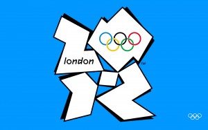
2012 London Olympics Logo

2012-london-olympic-logo
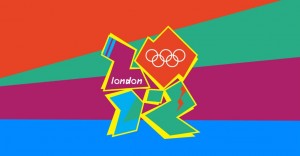
Oh my word The Olympics for some reason seem to be the heroes of missing the mark when it comes to graphic design. The London Olympics proved this true with a logo that just doesn’t make any sense.

What are the shapes? Why does it look like the drop shadow is coming from two different light sources? Why is a multimillion dollar global event producing work that a sixth grade could have created?
london-logo

SCARIEST Marketing We’ve Ever Seen – Seiko “Progress” Ad

October 5, 2015 in Blog, Marketing Monday

the scariest marketingAs a design / marketing person – and as a person with an undiagnosed slight case of O.C.D. – there are often marketing campaigns that physically cause me pain. By the way- our Rainbow Graphic for this is a perfect example – it uses the fonts I hate the worst – and it illustrates that design CAN be bad, and that it matters. Throughout the month of October, as we get closer to the spookiness of Halloween – we’re look at some of the SCARIEST marketing pieces that I’ve ever seen!

Seiko “Progress” Ad

Seiko – Progress to Seiko from Worldtempus.com on Vimeo.

This ad frequently shows up when I’m watching Hulu – and physically hurts.
1. I don’t know who any of these spokespeople are – other than Youtube tells me it’s “Hope Solo” – Who is she? Is she the daughter of Han and Leia?  (Nope – because then I’d know her)

Regardless – the people in this ad don’t “sell” it – they act like they’ve never been on camera before – and it just doesn’t feel right…