SCARIEST Marketing We’ve Ever Seen – London Olympics Logo
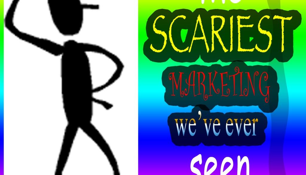
 As a design / marketing person – and as a person with an undiagnosed slight case of O.C.D. – there are often marketing campaigns that physically cause me pain. By the way- our Rainbow Graphic for this is a perfect example – it uses the fonts I hate the worst – and it illustrates that design CAN be bad, and that it matters. Throughout the month of October, as we get closer to the spookiness of Halloween – we’re look at some of the SCARIEST marketing pieces that I’ve ever seen!
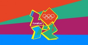
2012 London Olympics Logo
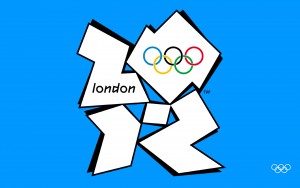
Oh my word The Olympics for some reason seem to be the heroes of missing the mark when it comes to graphic design. The London Olympics proved this true with a logo that just doesn’t make any sense.
What are the shapes? Why does it look like the drop shadow is coming from two different light sources? Why is a multimillion dollar global event producing work that a sixth grade could have created?
